ShopDreamUp AI ArtDreamUp
Deviation Actions


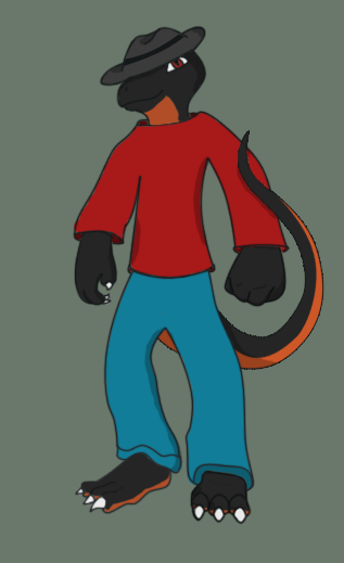
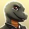
![[Commission] Victor after a fight](https://images-wixmp-ed30a86b8c4ca887773594c2.wixmp.com/f/d1723774-6478-4381-9c91-49b7557e208d/d58j851-32405c8e-3f0a-4481-943f-7347caccdfce.png/v1/crop/w_184,h_184,x_0,y_36,scl_0.36220472440945/_commission__victor_after_a_fight_by_mctaylis_d58j851-92s-2x.png?token=eyJ0eXAiOiJKV1QiLCJhbGciOiJIUzI1NiJ9.eyJzdWIiOiJ1cm46YXBwOjdlMGQxODg5ODIyNjQzNzNhNWYwZDQxNWVhMGQyNmUwIiwiaXNzIjoidXJuOmFwcDo3ZTBkMTg4OTgyMjY0MzczYTVmMGQ0MTVlYTBkMjZlMCIsIm9iaiI6W1t7ImhlaWdodCI6Ijw9OTExIiwicGF0aCI6IlwvZlwvZDE3MjM3NzQtNjQ3OC00MzgxLTljOTEtNDliNzU1N2UyMDhkXC9kNThqODUxLTMyNDA1YzhlLTNmMGEtNDQ4MS05NDNmLTczNDdjYWNjZGZjZS5wbmciLCJ3aWR0aCI6Ijw9NTA4In1dXSwiYXVkIjpbInVybjpzZXJ2aWNlOmltYWdlLm9wZXJhdGlvbnMiXX0.dA8X2hCfPjK24vAMfL-t40L0kN4pXuLxlPyr42jAxy0)
![[Commission] Victor after a fight](https://images-wixmp-ed30a86b8c4ca887773594c2.wixmp.com/f/d1723774-6478-4381-9c91-49b7557e208d/d58j851-32405c8e-3f0a-4481-943f-7347caccdfce.png/v1/crop/w_92,h_92,x_0,y_18,scl_0.18110236220472/_commission__victor_after_a_fight_by_mctaylis_d58j851-92s.png?token=eyJ0eXAiOiJKV1QiLCJhbGciOiJIUzI1NiJ9.eyJzdWIiOiJ1cm46YXBwOjdlMGQxODg5ODIyNjQzNzNhNWYwZDQxNWVhMGQyNmUwIiwiaXNzIjoidXJuOmFwcDo3ZTBkMTg4OTgyMjY0MzczYTVmMGQ0MTVlYTBkMjZlMCIsIm9iaiI6W1t7ImhlaWdodCI6Ijw9OTExIiwicGF0aCI6IlwvZlwvZDE3MjM3NzQtNjQ3OC00MzgxLTljOTEtNDliNzU1N2UyMDhkXC9kNThqODUxLTMyNDA1YzhlLTNmMGEtNDQ4MS05NDNmLTczNDdjYWNjZGZjZS5wbmciLCJ3aWR0aCI6Ijw9NTA4In1dXSwiYXVkIjpbInVybjpzZXJ2aWNlOmltYWdlLm9wZXJhdGlvbnMiXX0.dA8X2hCfPjK24vAMfL-t40L0kN4pXuLxlPyr42jAxy0)


Description
This is a first design for drake the mascot for my website. I know i have alot to go through. im actually happy how the hands came out though. ^^
drake was designed to be my websites mascot, but i never got to design it really until now. inspiration just hit me i guess XD
Drake is Tegu/Dragon
i wanted to get this done before we finally move.
so ill be working on it still
if u guys want to help u can red line it for me. but only if u want
Hit me hard on what needs to be improved. dont go lightly
P.S. thats a fedora, not a cowboy hat :3
Image size
317x519px 52.73 KB
Comments24
Join the community to add your comment. Already a deviant? Log In
Hey-o. Sorry for taking so long to do this. My critique won't be as good as ~MadKeeper's, but oh well. ANYWAY. ONTO IMPROVEMENT.
Well first off I'd like to say that overall the picture looks sleek and neat. It has a kinda... Cartoony look that I'm diggin'. I really love the way you drew the hands. LOVE it.
As for the fedora... I looks a bit flat. And if you actually look at pictures of fedoras, you can see that part of the brim folds up.
I think the other big issue that I see is the shoulders and the way the shirt fits ONTO his shoulders. In this picture here, you seem to have the shirt kinda floating off his shoulders. Look in the mirror at your shirt-it is directly onto your skin. However, it is good that you actually put some depth into the clothing; meaning, it's loose on the body... It's kinda hard trying to word what I'm saying there, sorry....
As for the shoulders, draw them at a less drastic slope. Again, if you look in the mirror and study your framework, you'll notice that while shouldrs do indeed slope downwards a bit, it isn't dramatic.
Oh, and the orange belly-stripe should probably start in the middle of his chest or near is collarbones, or go all the way to the end of his bottom lip; because the way you have it now looks a tad awkward.
So, in recap, here's what needs to be fixed: the hat, the neck of the shirt, the shoulders, and the orange underbelly near the mouth.
Other then those things it's a really great piece. The longer I look at it, the better I like it. And sorry if I sounded mean, I'm just trying to be helpful <img src="e.deviantart.net/emoticons/a/a…" width="19" height="19" alt="